Last month when the Fellowship of Presbyterians was rolling out the new Evangelical Covenant Order of Presbyterians they debuted and explained the new logo and the preferred acronym (that would be ECO not ECOPs).
At the time someone tweeted or blogged that the logo reminded him or her of X – and I have been looking back and trying to figure out who I saw say that both to give them credit as well as to be sure what X is. My failing memory tells me that they suggested the logo for Presbyterians for Earth Care shown above.
Well, after they mentioned that I started seeing similarities to other logos. I have included two examples above, one from the Friends of Calvin Crest and the other for a non-denominational church in our area.
Now to be clear, the Calvin Crest logo is not a deciduous leaf but a pine needle cluster or maybe a pine cone. But the look and feel is sure similar.
The presbygeeks out there know that this variation on a plant theme is nothing new for Presbyterians…

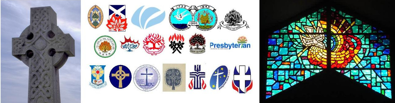
Yes, each of these global Presbyterian seals rocks the burning bush theme adopted by Presbyterians long ago. (Clockwise from upper left – old Church of Scotland seal, current Church of Scotland logo, Free Church of Scotland, United Free Church of Scotland, old Presbyterian Church in Ireland, current Presbyterian Church in Ireland, Free Presbyterian Church of Ulster, Presbyterian Church of Aotearoa New Zealand, Malaysian Presbyterian Church, Presbyterian Church in Canada, and Presbyterian Church of Taiwan)
[Note: Please see the comment by Alec below with a correction and some fascinating history of the symbols.]
So what got American Presbyterians sidetracked? There are a couple of exceptions

… and that BPC logo does have the burning bush. But for the most part American Presbyterians, and a couple more I threw in, tend to use the cross as their dominant theme.

(Tempting to leave this as an identification challenge but here are the logos: Associate Reformed Presbyterian Church, Cumberland Presbyterian Church, Evangelical Presbyterian Church, old United Presbyterian Church in the United States of America, Presbyterian Church (U.S.A.), Presbyterian Church of Australia, and the Uniting Presbyterian Church of Southern Africa.) You can spot the burning bush or flame symbolism there in some of these, but the central motif has become the cross.
Where logo design goes from here will be interesting to see. If early American Presbyterians had a logo they did not use it much. I don’t know if it was simply because they did not feel a need to have a brand identity or maybe it was not worth the extra cost to print it on their documents, or maybe they though it came too close to violating the Second Commandment. Maybe some research on that sometime.
But these days it seems necessary to have a logo for brand identity, and if it is simple and can be reduced to a small size for your online avatar all the better. ECO clearly thought that having a unique (sort-of) logo was a worth while endeavor to put early effort into.
We will see where it takes them.